Flora & Stone
Rebranding Project
Getting Started:
After reviewing Flora & Stone's original logo and discussing the brand's vision with the owner, I identified what elements worked well and where there was room to grow. I loved the illustrative framing above and below the main logo, but it wasn't functional within the logo itself. Instead, I drew inspiration from those illustrations to create a set of custom icons for Flora & Stone's website and digital presence, helping the brand feel more cohesive and versatile.
Brainstorming & Research:
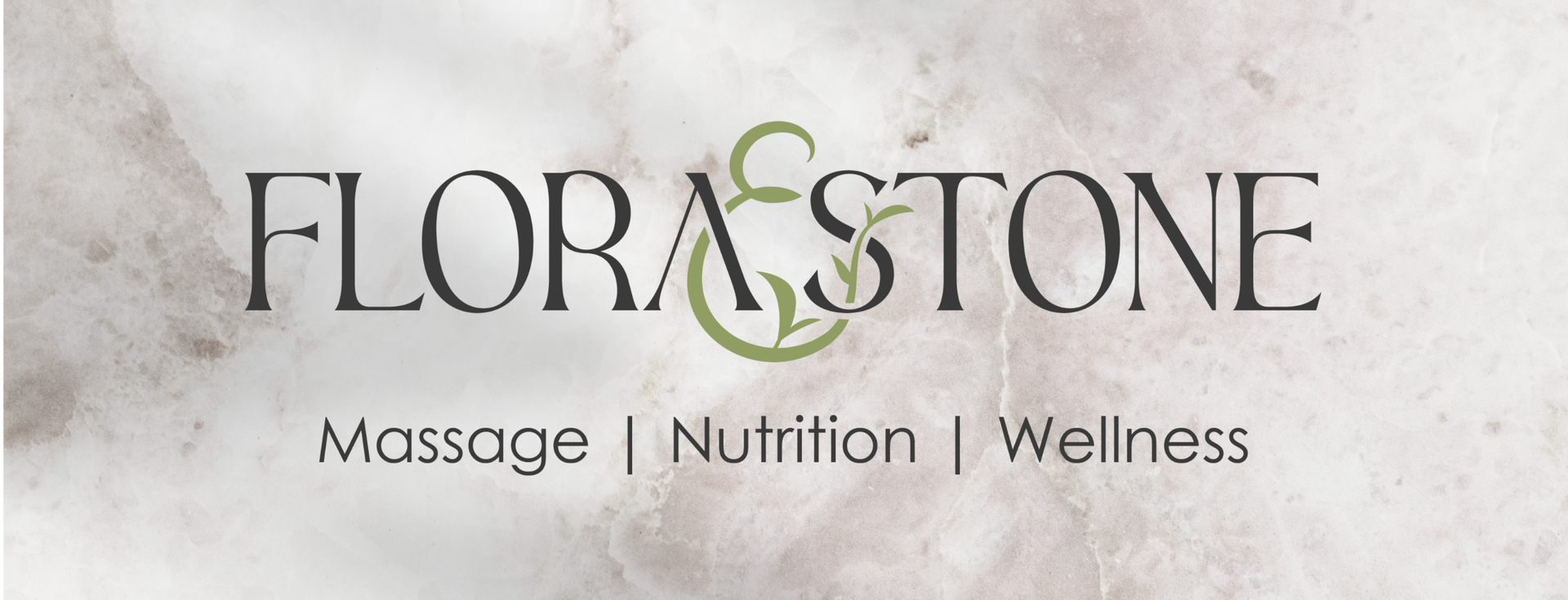
During the brainstorming phase, I focused first on the ampersand, knowing I wanted it to be the centerpiece of Flora & Stone's logo and a strong visual anchor for the brand identity. My goal was to balance the feminine flow of the ampersand with a structured, modern typeface to reflect the brand's core values: balance, tranquility, and personalized holistic care. Incorporating natural elements was also a priority, aligning with the owner's vision and highlighting the holistic nature of her services.
Design Execution:
Moving into Adobe Illustrator, I refined my ampersand sketches and experimented with structured typefaces to create a balanced, cohesive logo. One of the biggest challenges was integrating the ampersand with the capital "S" in "Stone" without disrupting the overall harmony of the design.I focused on perfecting the foundational structure (the "bones" as I call it) of the logo first before incorporating leaves and natural elements later to add personality and flair. Choosing a clean, modern sans-serif typeface for "massage, nutrition, and wellness" was also key, ensuring it supported the main logo without competing for attention.
Feedback & Refinement:
Feedback is one of the most valuable parts of the design process, and collaborating closely with my client was key to shaping Flora & Stone's visual identity. We finalized a structured serif paired with a flowing ampersand, accented by natural elements, and anchored by a clean, modern tagline. At this stage, I focused on perfecting the ampersand's flow and thoughtfully placing the leaves so they felt intentional, unique, and visually harmonious.While I believe in a "less is more" approach, the elements we chose needed to be versatile and meaningful. Color was another critical decision - we explored hues that conveyed balance, tranquility, and vitality while still capturing attention. Through ongoing conversations with my client, we refined each detail and set the brand on a strong, cohesive visual path.

Final Deliverables:
This project was incredibly rewarding from start to finish. Rebranding work is one of my favorite parts of design because it allows me to honor where a brand has been while visually elevating it to reflect where it's headed. For Flora & Stone, I developed a cohesive brand system that included a primary logo, monogram, and primary icon.Using a warm, clean, and natural color palette, I designed custom iconography that represents Flora & Stone's key services: massage, nutrition, and wellness. These illustrations not only bring personality to the brand but also create versatile assets that can be used across a variety of platforms, from their website and social media to advertisements and print materials.In the end, Flora & Stone transitioned from and outdated and unbalanced logo to a brand identity that feels structured, modern, confident, and uniquely their own - one that better communicated the professionalism, care, and holistic values at the heart of their business.


